

Graphic Design
Designing thoughtful, timeless brand experiences — from identity and motion to digital presence.
Where to start . . .
- Logo
- Strategy
- Visual Direction
- Websites
- Animation
- Multimedia
- Signage
- Page Layout
- Business Branding
Brand Identity.
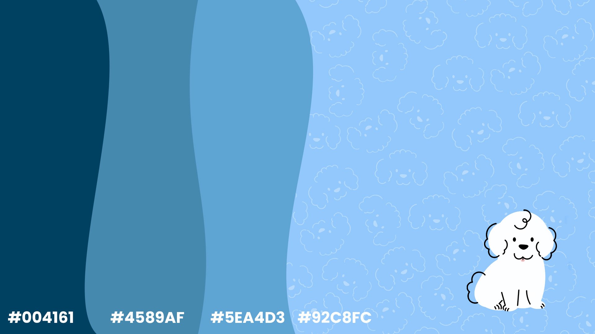
Tide & Tails
1
Tide & Tails wanted a coastal-inspired brand identity to reflect their Cavoodle breeding program and the relaxed lifestyle of Australia’s shoreline.
Drawing inspiration from the ocean and the warmth of companionship, we developed a soft, coastal color palette and friendly typography to capture the playful and caring nature of their dogs.


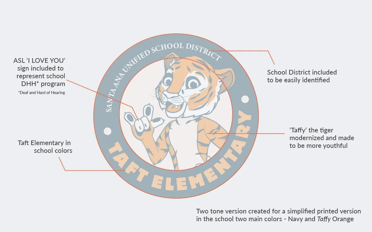
Taft Tigers Elementary
2
Taft Tigers Elementary wanted to update their tiger mascot while celebrating and highlighting their unique Deaf and Hard of Hearing program, the only one in the area.
We refreshed the tiger mascot to feel energetic and approachable, incorporating elements that celebrate the ASL community and make the program visible and inclusive.


Digital Design.
Xero e-bikes
3
Xero Ebikes, a Southern California-based company, needed a website that showcased their electric bikes while reflecting the brand’s modern, adventurous lifestyle.
A clean, visually-driven layout was developed to highlight products, features, and the California outdoor vibe. Emphasis was placed on user experience, clear navigation, and imagery that captures the excitement and freedom of riding Xero Ebikes.
he website mockup presents a polished, engaging digital presence that positions Xero Ebikes as a stylish, approachable brand for riders in Southern California and beyond.
Save our sites Conference
4
Save Our Sites wanted a rebrand to create a modern, cohesive look to better connect with supporters and donors both online and in person.


Inspired by making meaningful and strong networks of professionals, we updated the logo, refreshed the color palette, and introduced typography that feels both approachable and professional.The new branding has streamlined communications and created a stronger visual presence online and in print.
On Your Side
5

During the pandemic, KY3 produced a feel-good animated video to uplift the Springfield community.
The fully animated format kept the visuals clean and easy to follow, even when muted during commercial breaks. Highlighting local acts of kindness and community spirit, the video spread positivity and strengthened KY3’s connection with its audience.
Animated Stamps
6
Print Design
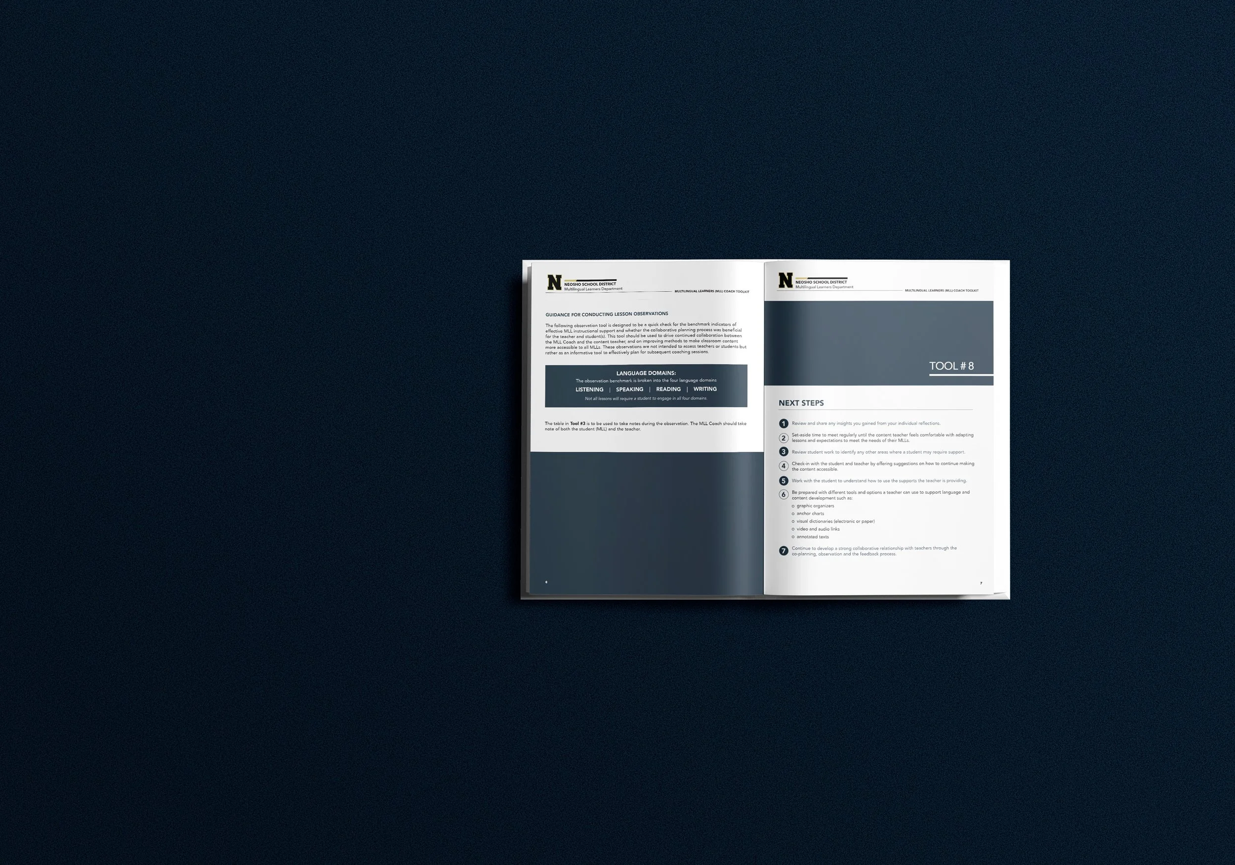
Neosho School District ELD Department
7
ELD teachers needed a consistent, standardized way to track student performance and support ELD learners across classrooms. A booklet was developed to function like a textbook, combining clarity, organization, and visual structure to make it easy for teachers to use as a reference and guide.


Design elements—typography, layout, and hierarchy—were chosen to create a professional, approachable resource.The resulting ELD book provides teachers with a uniform, practical tool for assessment and instruction, streamlining classroom practices and enhancing support for ELD students
Flying Colors Marketing
8
Flying Colors Marketing needed a cohesive brand identity that could unify both their print materials and digital presence, creating a consistent look and feel across all touchpoints.
The full branding encompassed logo design, color palette, typography, and print assets, paired with a website that reflected the brand’s personality. The visual system was designed to be versatile, professional, and eye-catching, ensuring recognition across multiple formats.
The comprehensive branding and website provide a unified, polished presence for Flying Colors Marketing, strengthening their visual identity and making all materials—online and offline—feel cohesive and professional.

BRAND IDENTITY

DIGITAL DESIGN

PRINT DESIGN